Fintastic Shack
A seafood logo where one letter does double duty across two words.
- Categories
- Year
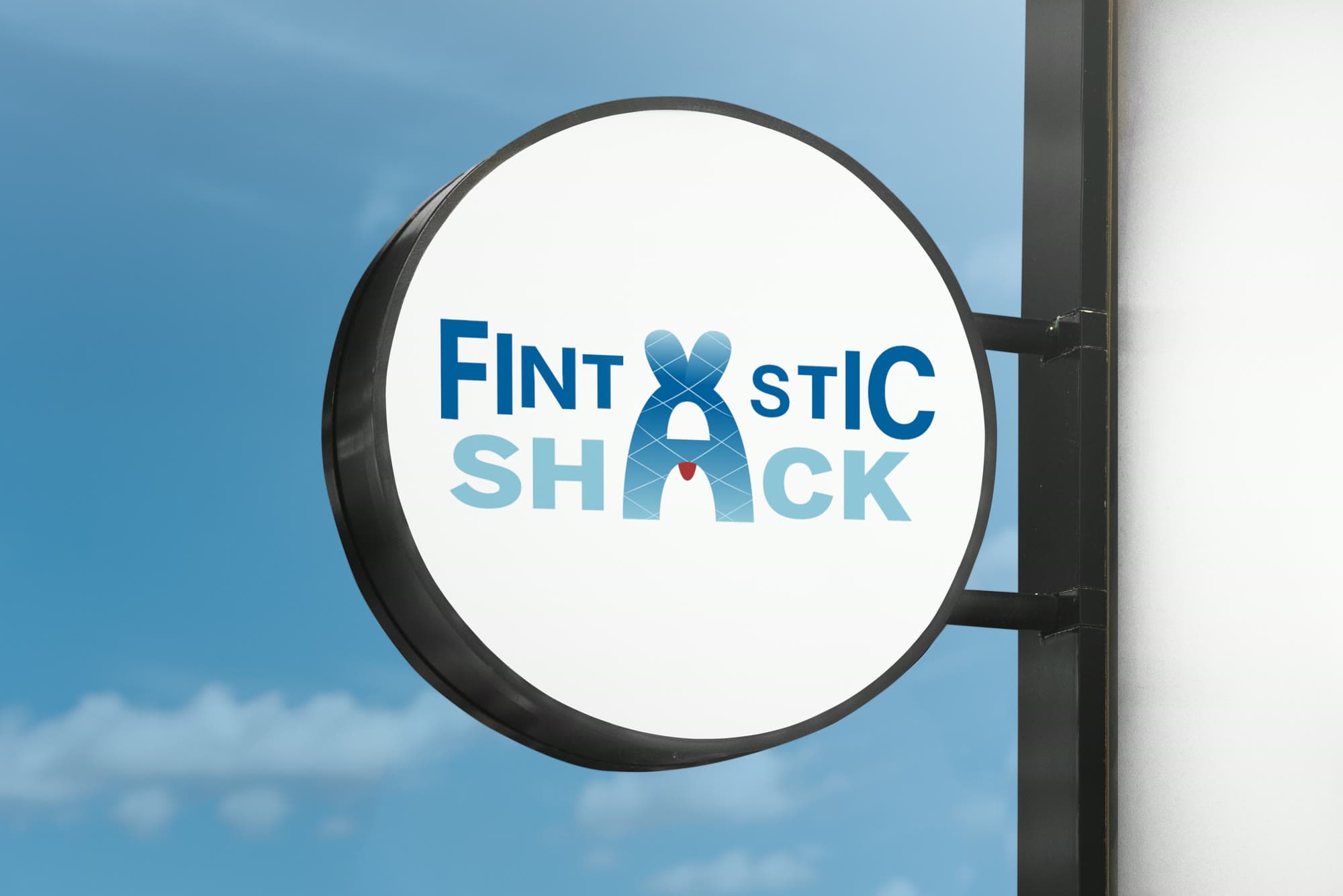
TL;DR
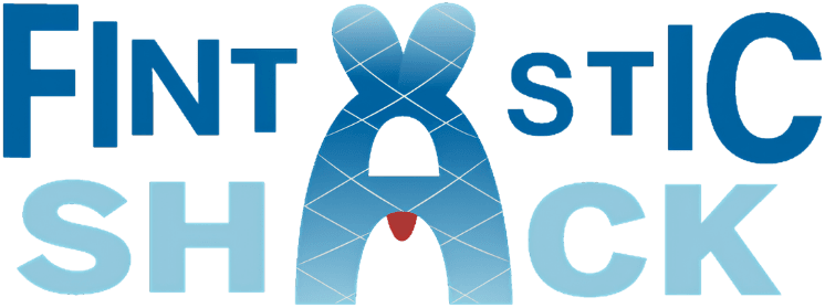
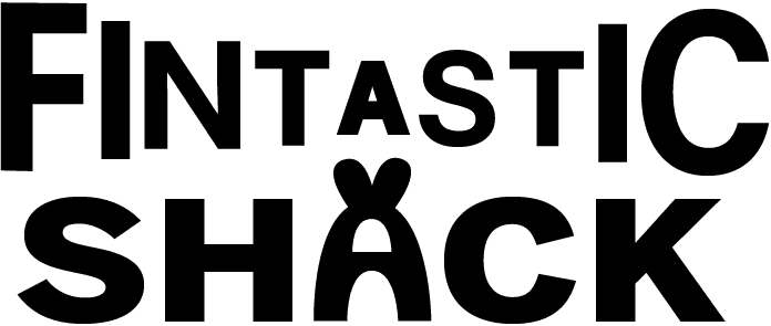
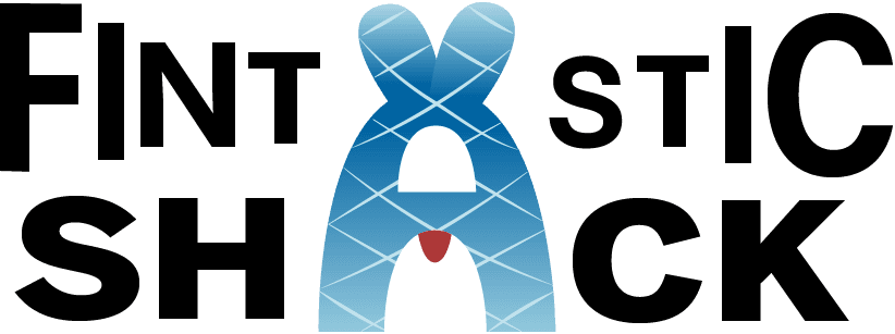
A complete logo lockup for The Fintastic Shack, a new family-owned seafood restaurant. Rather than setting a fish icon beside the name, I built the mark into the name! A custom ‘A’ that serves as the ‘A’ in both Fintastic and Shack, reads as a fish, and hides a diner in a bib in its negative space.
- Role
- Brand Designer — concept, logo design, visual identity
- Timeline
- August 2026
- Team
- Solo
- Tools
- Illustrator, Photoshop, hand sketching
- Context
- Branding · Solo · Academic
Background
The Fintastic Shack is a newly founded, family-owned seafood restaurant. The brief called for both a brandmark and a wordmark, combined into one cohesive lockup.
The family was described as friendly, fun, and fond of puns, and even the restaurant’s name reflects that personality. The identity needed to feel playful without becoming overly gimmicky.
Playful, but still practical
I wanted the logo to reflect the family’s fun personality without sacrificing clarity. The design needed enough character to feel memorable, while still being simple and readable enough to work on signage, at small sizes, and in a single color.
Most attempts at a playful restaurant logo solve this by bolting a cute icon onto a clean wordmark, which reads as two designs sharing a space. I wanted the joke to live inside the typography, where it could not be separated from the name.
Process
I started on paper, working through fish forms, letterforms, and ways a symbol could sit against the name. I was being pretty literal with the early iterations. For example, a fish wearing a hat and a fish as a standalone icon. However, they felt more decorative than integrated into the identity.
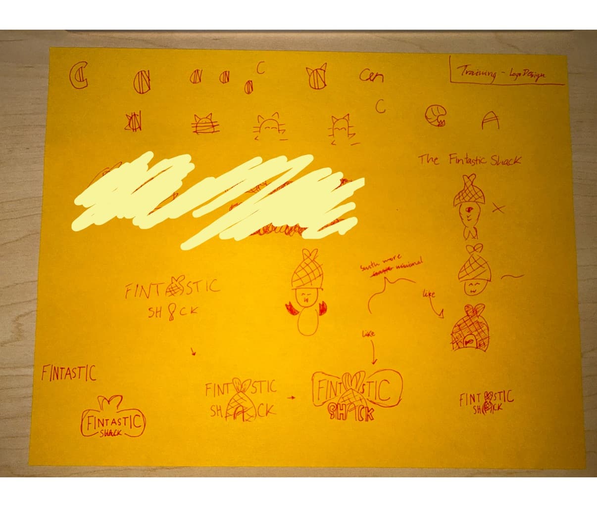
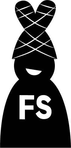
I first started out with three brandmark versions in black and white before any color, which kept the early work on silhouette and readability rather than palette.
The idea came from the name itself. When I stacked FINTASTIC over SHACK, the two ‘A’s lined up closely enough that one custom letterform could connect both words. This made the brandmark feel like part of the logo, rather than something added on afterward.
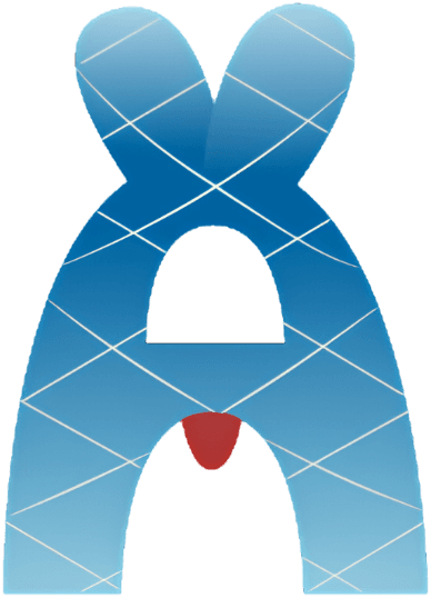
The custom ‘A’ is fish-shaped, with tail fins forming the apex and a net texture across the body. Its counter reads as a person seated in a bib, and the small red shape works as either that bib or the fish’s tongue depending on how you look at it. The ambiguity is the point: it is a joke you find on the second look, not one shouted on the first.
From there, I focused on refining the proportions so the custom letterform could stand out without hurting readability. I also scaled the letters in FINTASTIC from large to small and back to large to subtly suggest the shape of a fish, with the F as the tail and the C as the head.
Layered blues carry water and freshness; the single red accent is the only warm element in the system, which is what draws the eye to the detail that carries the joke.
Final product
The lockup is a clean two-line wordmark with a custom letterform at its center, doing the work a separate icon usually does.
It holds up under the tests that matter for a restaurant identity: it survives in a single color, stays legible at small sizes, and reads correctly on signage.
Status
Completed August 2026 as an academic branding project. Deliverables: concept sketches, standalone brandmark, refined lockup, color variations, and a signage mockup.
Reflection
The thing I underestimated was how much refinement a simple mark takes. The final ‘A’ went through many more passes than the sketch suggested it would, almost all of them small — a few degrees of angle, a slightly different counter, a red shape moved two points.
The larger lesson was where to put the personality. My early directions kept the wordmark clean and put the fun beside it, which is the safe move and also the forgettable one. Building the joke into a letterform meant it could not be removed without breaking the name — and that constraint made the mark better, because it forced the playful idea to also be structurally correct.
Working between sketches, Illustrator, and Photoshop across the project also made me substantially faster in both programs, which I have carried into everything since.