Longhorn Loop
A personalized event board that brings events from 1,000+ UT student organizations into one feed.
- Categories
- Year
TL;DR
Longhorn Loop helps UT students find campus events that match their interests, save what they want to attend, and keep track of everything in one place.
- Role
- Design Fellow → Design Lead (Aug 2026)
- Timeline
- Aug 2025 to Present
- Team
- Product: lead + 2 fellowsDesign: lead + 2 fellowsEngineering: lead + 3 fellows
- Tools
- Figma, Linear, Notion
- Context
- Mobile · 0→1 · Consumer · Beta Sept 2026
- I designed
- Account creation and onboardingEvent details and map overlayExplore filtersProfile and edit profileReporting flowAcademic standing updatesCore components: buttons, dropdowns, and search
Background
Campus events are everywhere, just not in one place
UT Austin has more than 55,000 students and over 1,000 recognized student organizations. There is always something happening, but finding those events is scattered across Instagram, GroupMe, flyers, and HornsLink.
Students can miss an event that would have been perfect for them simply because they never saw the post.
Asking students how they actually find things to do
We started with a survey of 30 students, then ran two rounds of interviews with about 20 students total. The first round helped us understand how students currently discover events. The second happened later, once we had working designs, so we could check whether our decisions still made sense to real students.
- Survey, 30 students. How students currently find campus events and what makes an event worth attending.
- Interview round one, about 10 students. How students discover events and where that process breaks down.
- Interview round two, about 10 students. How students reacted to our working designs and whether our earlier assumptions still held up.
Three things students needed before they would show up
1. Show me why it’s worth going. Students make the decision pretty quickly. Things like free food, swag, prizes, or an interesting speaker can be the reason someone chooses one event over another. A title and time alone usually aren’t enough.
2. Show me why this event fits me. Students wanted to know why an event was relevant to them without having to open every single event first.
3. Help me remember it. Finding an event was only part of the problem. Students would see something they wanted to attend, move on, and then forget about it later.
How might we make campus events easier to discover while still showing students the ones most relevant to them?
HornsLink works more like a directory. You usually go there when you already know what you’re looking for. We wanted Longhorn Loop to feel more like a feed that learns from the interests students choose and helps them go from finding an event to actually attending it.
Process
01. Simplifying the navigation
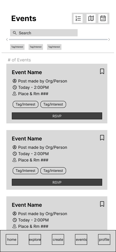
Our first structure had five tabs: Home, Explore, Create, Events, and Profile.
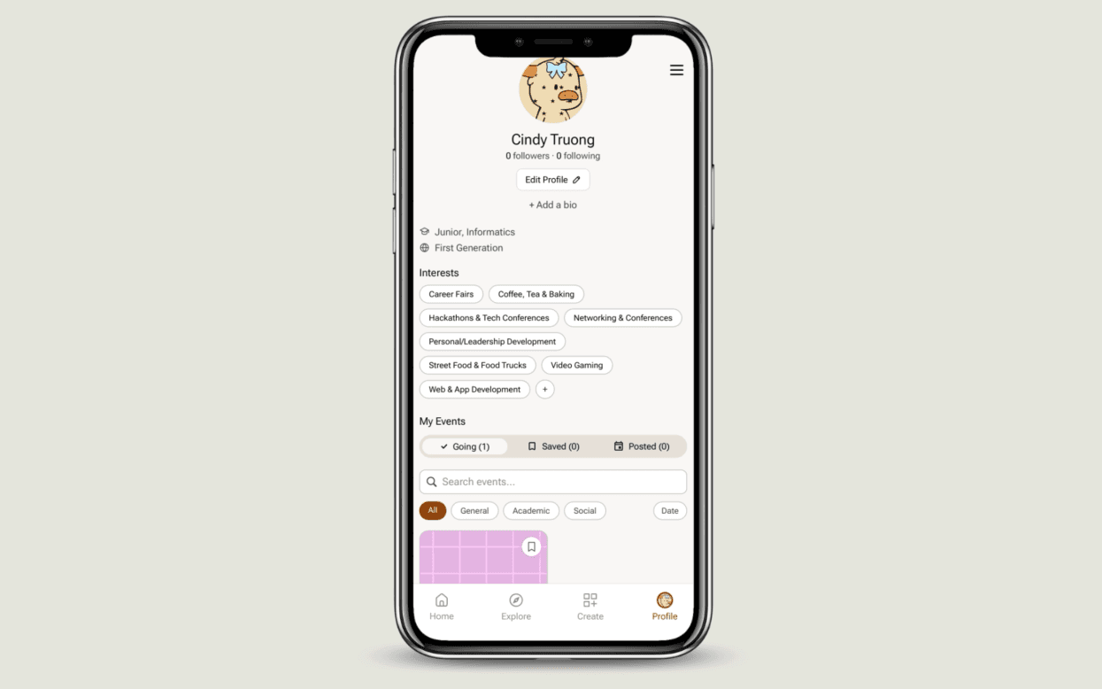
Events and Profile started to feel repetitive because both were places students went to find their own activity. Instead of keeping another destination in the navigation, we moved Events into Profile and separated them into Going, Saved, and Posted.
That brought the navigation down to four tabs and gave Profile a much clearer purpose.
02. Making onboarding worth it
The feed only works if we know what a student cares about, so interest selection became one of the most important parts of onboarding.
Our first version used a 3 by 4 grid of unlabeled tiles. Students had to choose at least three interests, but there was no search, no grouping, and no easy way to find something specific.
I redesigned it into collapsible categories with search and a running count of the interests a student selects. If someone searches for an interest we don’t have yet, they can send it in. That turns a missing option into useful feedback for us instead of leaving them at a dead end.
The avatar step had a similar problem. The early version forced students to choose from four preset Bevos before they could continue.
I changed it so students could upload their own photo, customize a Bevo, or skip the step completely. They still get the fun personalization if they want it, but it isn’t something we force them to do.
03. Making every flyer fit
Event cards were trickier than they looked because student organizations create their own flyers in all kinds of sizes. A feed with vertical, square, and horizontal images starts to feel messy pretty quickly.
I tested the different flyer sizes inside a two-column layout and landed on a fixed card ratio with consistent information underneath: organization, date, time, and location.
The flyer can change, but the structure around it stays predictable.
04. Designing for when something goes wrong
Because students can post events, we also needed a clear way to report something that shouldn’t be on the platform.
The flow covers violent or harmful content, misinformation, troll or spam content, and concerns that don’t fit one of those options. Students have to choose a reason and add a description before they can submit the report.
It’s a small part of the overall product, but it matters once the app moves beyond a prototype and into beta with real students.
Final design
Campus, all in one place
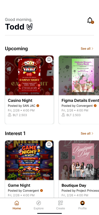
Home uses the interests students choose during onboarding to shape their event feed. Upcoming events sit near the top so students can quickly see what’s coming up, while the rest of the board gives them a personalized way to browse campus.
Find something outside your bubble
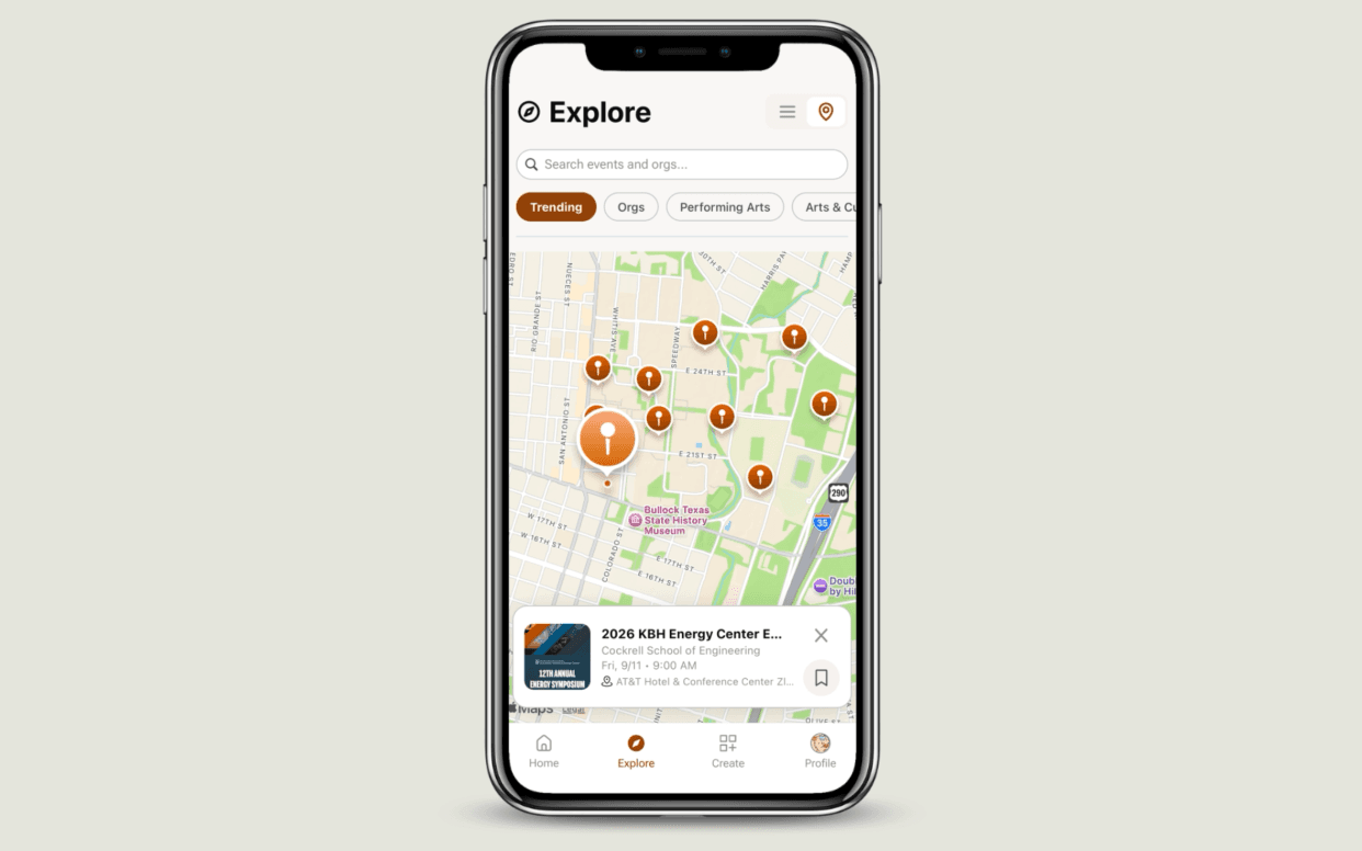
Explore gives students another way to browse beyond their personalized Home feed.
They can search and filter by things like time of day, in-person or online, distance, and perks such as free food, swag, or prizes. The perks filter came directly from our research because students kept bringing those details up when explaining why they would actually attend an event.
Everything you need in one tap
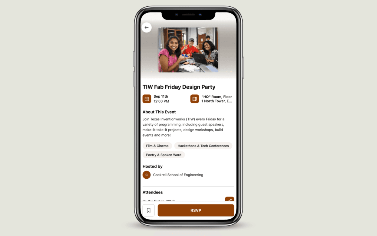
The event page keeps the information students need to make a decision in one place: date, location, host, interest tags, who’s going, and RSVP.
Students can save an event and get reminded before it starts, which helps with the problem we heard during research where someone would find something interesting and then forget about it.
Tapping the location opens a map view with walking distance and a handoff to Maps. If an organization hasn’t added a location yet, the page says so clearly instead of leaving the student guessing.
Your events, three ways
Profile is where students can keep track of Going, Saved, and Posted events. Each section has its own search and filters.
Organization accounts use the same general structure with Upcoming and Past events, so the experience still feels familiar.
Built for a team that changes every year
Longhorn Loop is built by student teams, and fellows rotate out each year. That made the design system especially important.
I built and maintained reusable patterns for buttons, dropdowns, search, and form controls so new designers can keep building without having to recreate the same decisions every year.
The states that are easy to forget
Not every important screen is going to be a portfolio hero shot. I also worked through error states, empty states, confirmation screens, and smaller updates so students always know what happened and what they should do next.
One example is the academic standing prompt. It asks returning students to update their year over time so the feed doesn’t keep treating someone like a freshman after they’ve moved on.
- Invalid UT email
- Required fields not filled
- No results, with send it in
- No location listed yet
- Leave without saving
- Undo delete
- Update academic standing
Status
Where it stands
Longhorn Loop enters beta testing in September 2026. I joined the project during ideation in August 2025 as a design fellow, and I now lead the design team.
- Screens and states designed
- 70+
- Flows owned end to end
- 9
- Design fellows I now lead
- 2
- On the project
- 1 year, from ideation to beta
Reflection
Designing for a team that changes
One of my biggest takeaways from this project is that good design isn’t only about the screens I personally finish.
Fellows rotate out each year, so components, documentation, and clear states matter because someone else eventually has to understand the work and continue it.
We’re also the target users, which is helpful but can be risky. Since we’re all UT students, it’s easy to assume our own habits represent everyone. The second round of interviews helped us check those assumptions against students outside of the design team.
From owning flows to leading the product
As a fellow, I mainly focused on the flows assigned to me. As design lead, I have to look across everyone’s work and make sure it still feels like one product.
A lot of that has been less about making every screen myself and more about critique, consistency, and helping other designers work through their decisions.
What I still want to learn
Our research helped us build something that makes sense in interviews and usability testing, but beta is where we’ll find out whether it actually changes behavior.
The question I care about most is pretty simple: does a student discover an event they would have missed otherwise and actually go?